
京都大学
Kyoto University
Rebrand a product for a school in Japan
Project Overview
Kyoto University is one of Japan's Top Universities, so having a well-structured and designed website is crucial for their school to stand out in the educational world online.
Problem
Current site is overwhelming, which may deter prospective students and investors.
Solution
Revamp the website for ease of access for local and international audience of interest
Role
Product Designer, UI/UX Designer, UX Researcher
User Research, Interaction Design, Visual Design, Prototyping & Testing, Information Architecture, Wireframing, Prototyping, Mockups, Figma
WORK IN PROGRESS
All logos and digital images used in this project are accredited to Pinterest, Shutterstock, and Kyoto University
This was not commissioned officially by Kyoto University - All content related in case study is purely educational
Insights + Surveys
I've briefly interviewed a sample size of 10 young adults ages 18-26 who has interest in higher education to navigate the current school site
in order to research pain points from our current website:
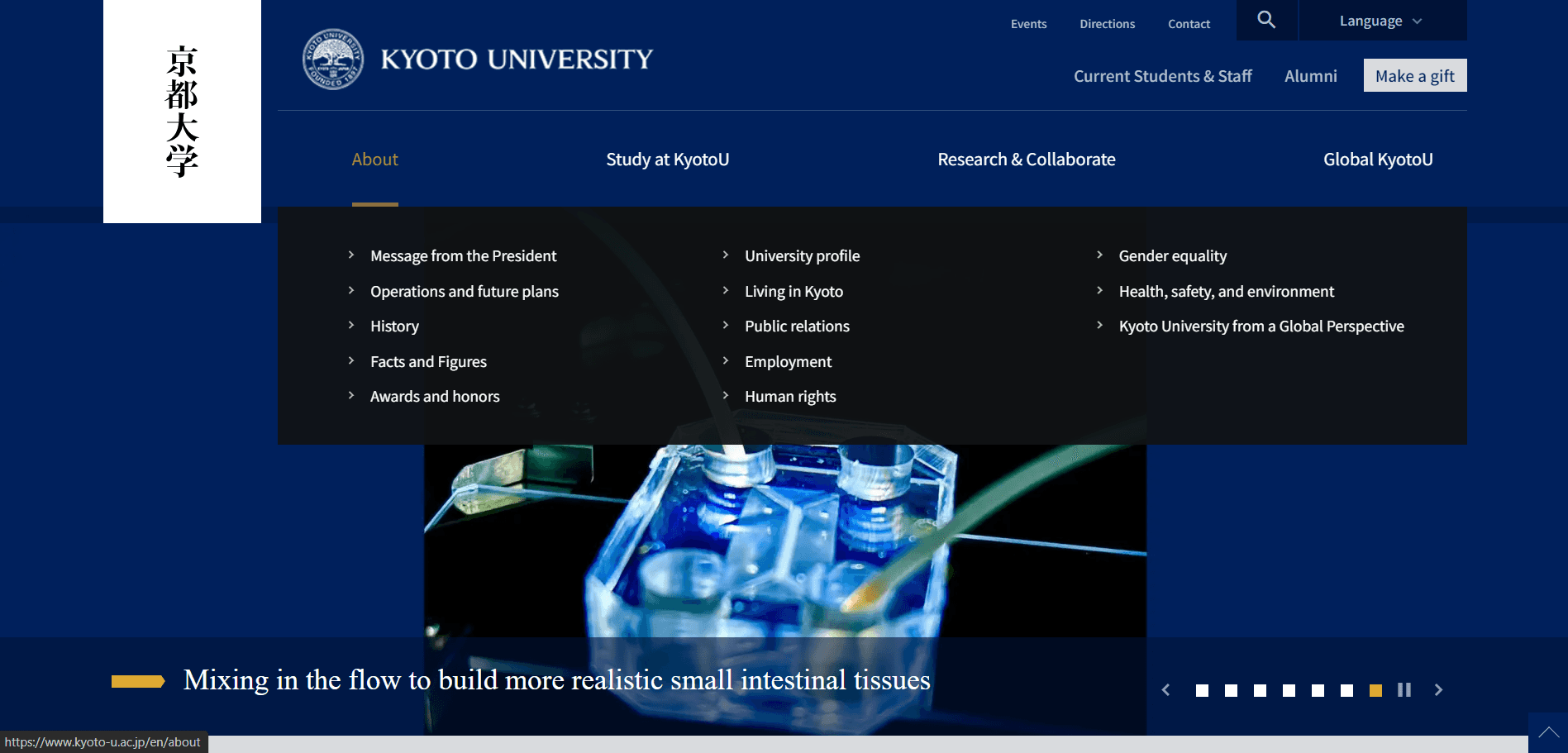
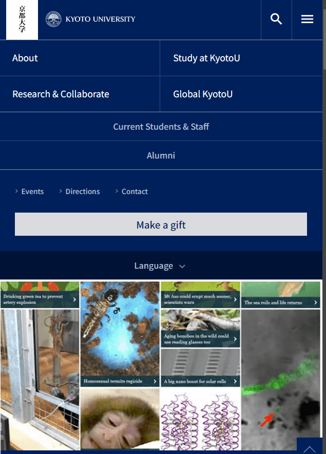
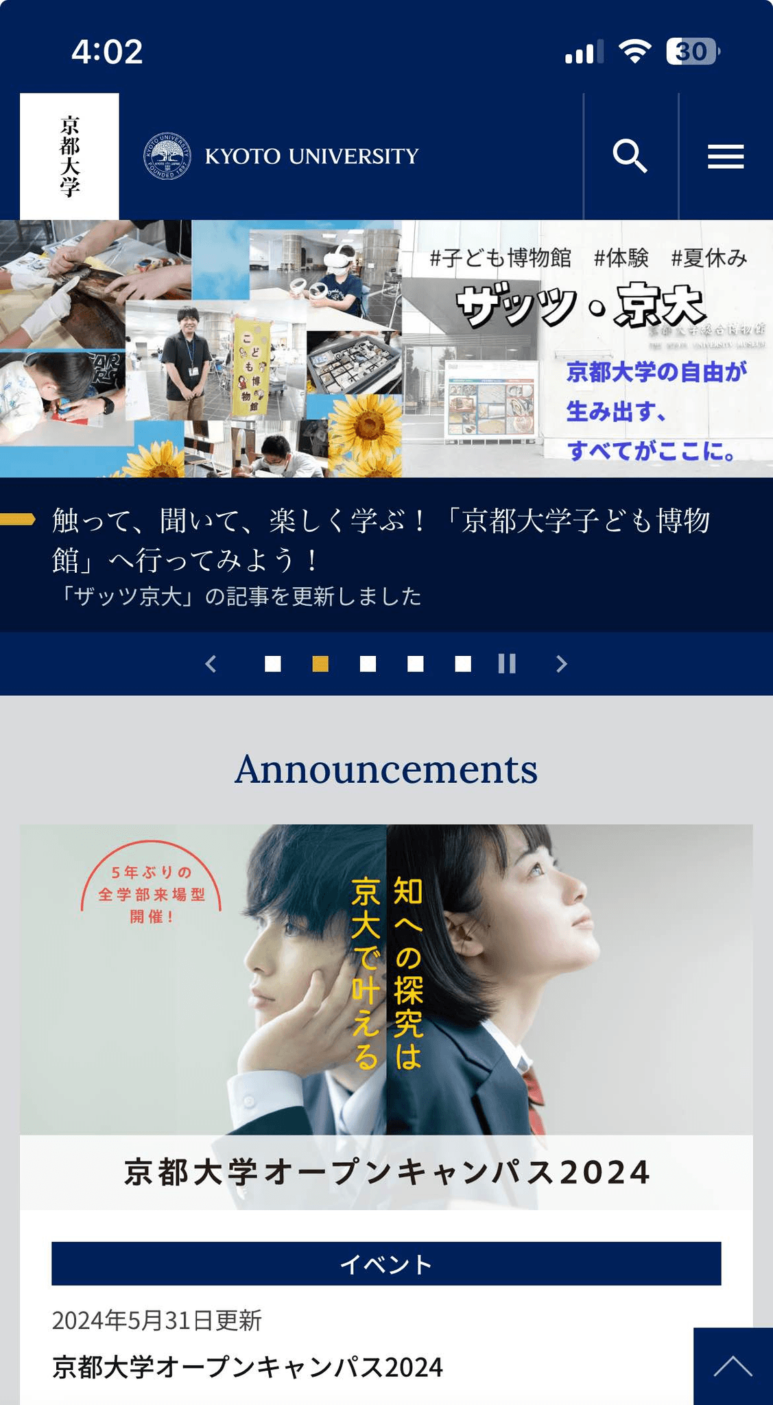
These screenshots are taken at 100% zoom on a full browser, 1/3rd browser, and mobile respectfully
Moderated User Study Criteria
To understand user navigation from home page based on these page goals:
To learn more about the school and what it stands for
Finding educational information for prospecting students
Navigating to career and research opportunities for graduates and doctors
Doing the same activities above but on a mobile screen
Pain Points
60% of individuals wanted an easier way to organize the information of what they're looking for
90% of individuals felt that the navigation bar was overwhelming and that it was too big
Understanding our Users
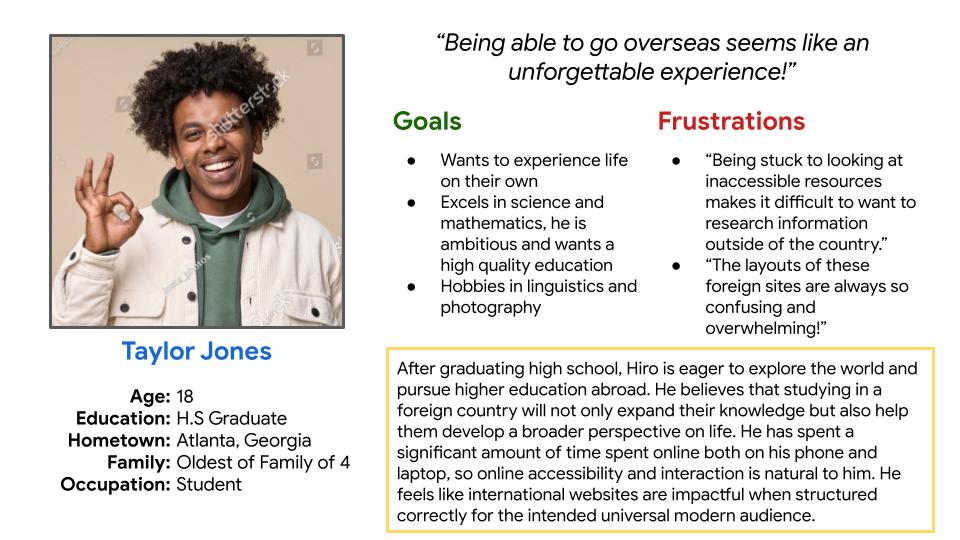
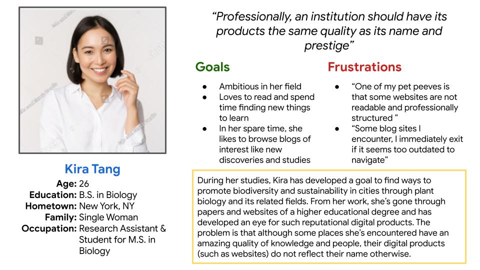
Developing a full understanding of user's pain points is important in order to develop a core reflection of our main user group into user personas.
User Personas
User Journey Map
These user journey maps for our personas highlight the navigation and user experience with our current client's website

Taylor Jones | Goal: To research information about school for international studies
Action
About the school
What Majors School Offers
Task List
Google online for school in question
Visit site and go to about
tab
Go to university profile
Go to university statement
Visit website
Study at Kyoto U tab
Go to education and admissions page
Undergrad degree programs
Feeling Adjective
Excited to look for information about the school
Overwhelmed with all the subsections in nav bar
Excited to see what majors are available
Misleading Page Titles
Lead to feelings of confusion
Improvement
Opportunities
Have the school page be engaging and positive for good first impression
Have navigation easier to search and access
Refine Information Hierarchy for better organization

Kira Tang | Goal: To look up school for research discoveries and career opportunities
Action
Look up Research
Look up Career Opportunities
Task List
Google online for school in question
Visit site
Go to Research & Collaborate Tab
Go to Research News
Visit Website
Research & Collaborate Tab
Go to Careers Tab
Feeling Adjective
Eager to look for information about research
Straight Forward but had to filter through lots of texts
Excited to see what jobs are available
Straight Forward and happy to search for a position
Improvement
Opportunities
Have drop down or accordian menus to reduce text conjestion
N/A
Competitive Audit
To determine the best layout for this revamp, I looked at other educational websites that allow people of interest to be able to navigate
and be enticed to learn more about the platform in question. I focused my analysis on how each school structures their site for engagement.

Khan Academy is an indirect competitor to a University Site. However, it is highly revered as a successful educational product for students and teachers of all types of educational levels.

The University of Tokyo is a direct competitor to our university site. Also of the top public schools in Japan, they rank similar to our client’s rank and prestige. As of 2024, it is ranked higher than our client’s.

Tohoku University is another direct competitor to our client’s. Whereas they also hold prestige as another one of Japan’s top public schools, they rank lower than our client’s.

USC is an indirect competitor. Located outside of Japan, based in America, they are a prestigious private school with an honored heritage to their name with alumni, researchers, & teachers.

NYU is also an indirect competitor as it is also an American Private University. Compared to the Californian Private School, alumni spirit is not as strong, due to the urban culture surrounding this school.
Strengths
new products are up front and center, shows positive company prospects
bright and simple imagery to lead with information
simple hierarchy to access the level of product users require
unique as all types of people of all ages (from K12 to higher education) can use features with an equal amount of ease
positive reinforcement as their main motto within their features
Weaknesses
content is overwhelming on full web screen
Strengths
showcase of events, research, and articles on homepage shows school’s prospects and developments
international audience is taken to considered based on translation and hierarchy
Weaknesses
mobile aspect ratio is difficult to navigate
lack of animation in some parts of navigation
difficult map access
information hierarchy is cluttered
Strengths
well sectioned and organized
interaction animation for positive user experience
layout is well thought out for both local and international users of interest
Weaknesses
a bit too simple, bland feeling looking through
Strengths
first impressions are strong and clear with a clean and modern layout
all content and news on homepage are spaced out and not overwhelming
good use of cards for information delivery
navigation phrases feel personable
Weaknesses
text font is inconsistent on nav bar
navigation titles can seem unclear
Strengths
strong use of cards for easy navigation
simplified homepage, straight to the point regarding student audience
well structured navigation
Weaknesses
lack of animation
bland use of UI, there is a lack of personality to the product
Overall
Khan Academy is highly accessible with an emphasis of equity for all levels of learners, making users use and sign up for their product to be positive and engaging.
Overall
Tokyo University is similar to our clients, only slightly easier to navigate due to more sectioned topics on navigation bar. However, the layout of the homepage is still cluttered and information navigation is still difficult to manage.
Overall
Tohoku University in comparison to our client, is better structured with clear organized topics without cluttering. However, due to that fact there is a lack of personality with their products in the purpose of showing off the culture and prospect of the school.
Overall
USC’s web product is well organized without overwhelming content at face value. With their inspiration to use newsletter structure, face pages - the homepage- is layered on top of sectioned features depending on user’s needs.
Overall
NYU’s web product is clean and straight to the point with a clear amount of information for prospective students and alunmi alike. However, there is a lack of “life” to the website due to its simplification, such as the school’s accomplishments and events.
Ideation
The information I’ve gathered from user research and site analysis are set to be solved through these goals:
To be able to simplify the nav bar without sacrificing core bits of information
Utilize Core Design Features such as Cards to create a more open and accessible navigation experience
Remove redundant or unnecessary features that cause clutter
This is mainly focusing on the revision of Information Architecture and Visual Hierarchy and Organization of our product.
Low-Fi Wireframing
I liked the white banner so I wanted to keep that feature on a mobile screen. Although its a sophisticated memorabilia,
on a small or mobile window, it may be redundant and cluttered seeing two different logos of the school.
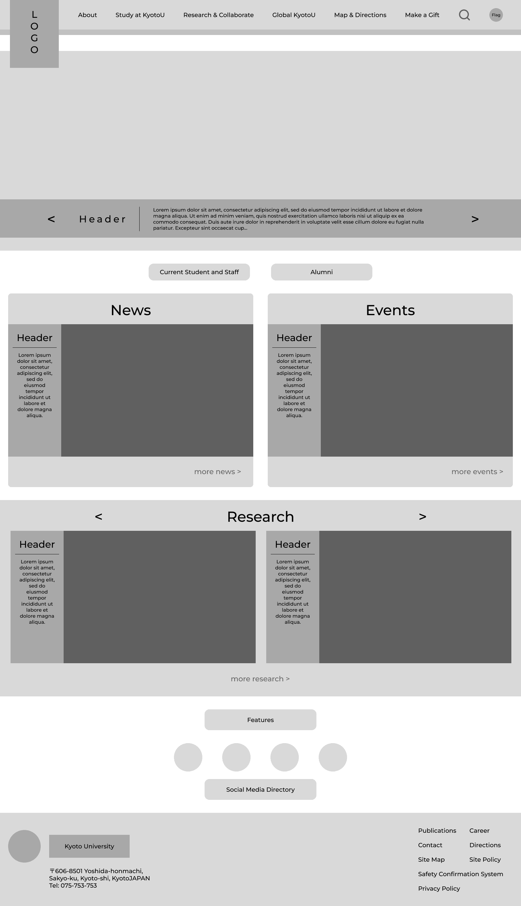
Digital Wireframe / Lo-Fi Prototype
Desktop
Tablet

Mobile

Navigation Feature - Desktop
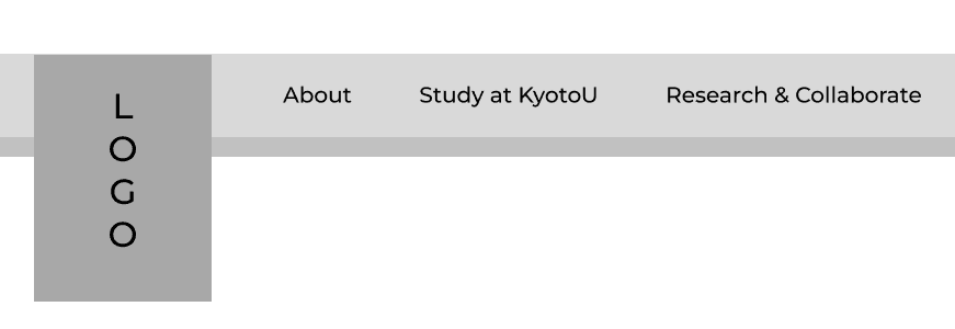
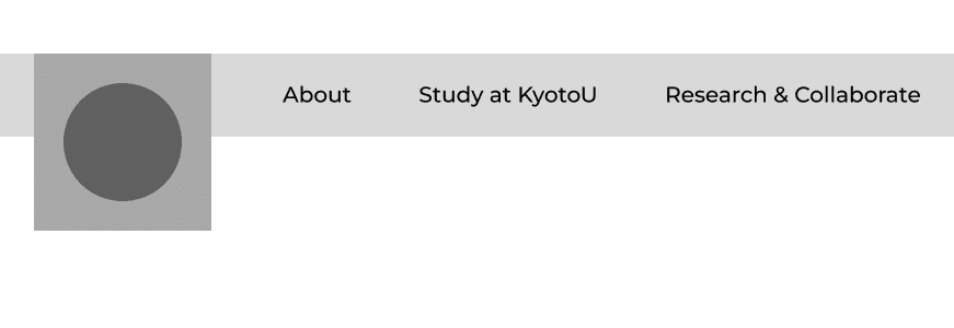
On Desktop Browser, I wanted to refine the nav bar make the banner of the school name less of a burden on screen space.
So I created a scroll condition where it would shorten the banner to show off the emblem and drop back down on hover.
We could also do a pass on the tab strings on the navigation to make them more concise
but for the sake of the site’s current phrasing, we wouldn’t want to change too much to make it unfamiliar.
Page Top + On Hover
Scroll + Off Hover
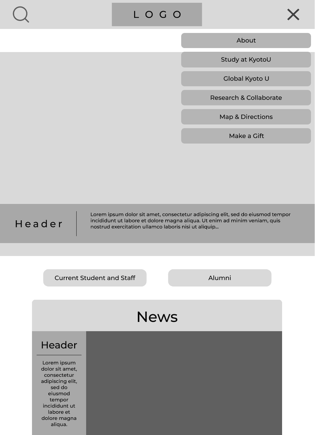
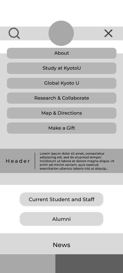
Hamburger Menus
The following images are active hamburger menus (on click) for screen size variations
Tablet
Mobile
Topic Page
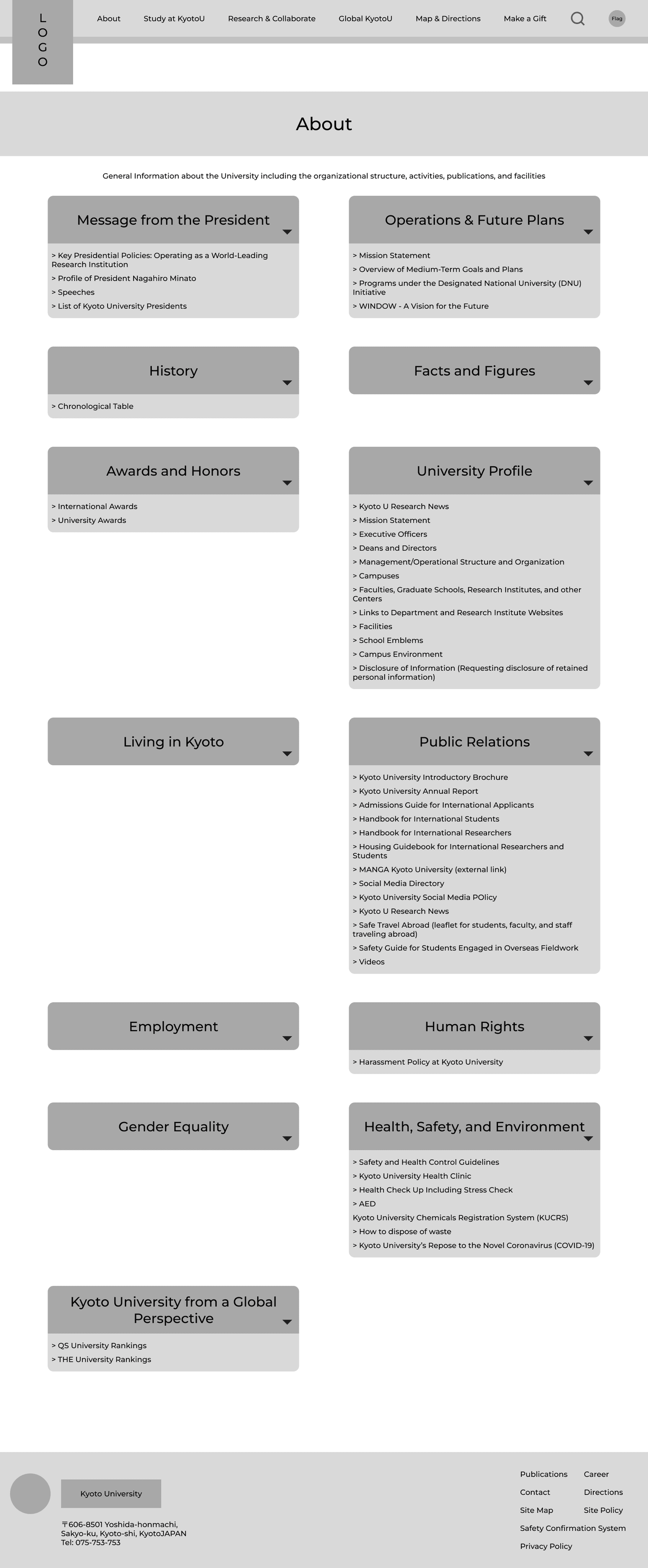
The following screenshot will show when the user clicks on a tab from the navigation bar and goes to the topic page regarding their inquiry.
For this example, we will use the About page to demonstrate the wireframing.
Desktop
Tablet and Mobile
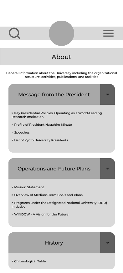
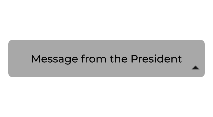
Dropdown Closed
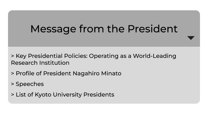
Dropdown Open
Work in Progress!
This project is on HIATUS for now :)
Currently working on: User Research ➤ Hi-Fi Prototypes and Interaction Design
WORK IN PROGRESS
